Visual Storytelling
Oct. 10th, 2019 11:26 pmAt long last, another installment of isozyme's Comic Art Gripes!
This time, featuring a particular splash page:
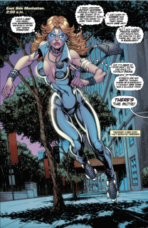
I'm going to go hard on this page because it exemplifies a giant problem I see with a lot of superhero comics. The text is telling the audience one thing, and the art is haring off in its own direction, doing another. For effective visual storytelling, you have to be conscious of what information is being conveyed by the drawing, and make sure that's the same stuff you mean to say. The above example is not managing that.
The text gives us these key takeaways:
Let's go through point by point and see how well the illustration is doing at conveying this information.
For each of the four key takeaways, the art is sacrificing a way it could be helping the story in favor of being sexy. In some cases, it's actively working against the text. This is bad storytelling! It's squandering the medium! It's infuriating! I'm not saying that I don't like sexy lady pictures. I am a huge lesbian. Women are great! The skin-tight outfit and plunge neckline are sexy and make sense for the story at the same time. Great! Boobies! Love 'em. But sexy lady is not the most important idea going on here! If I wanted that, I'd look through my tumblr likes. I want to read a good story about superheroes and their emotions! Comics are awesome. They have all these cool tools to make narrative, which is why it's so disappointing when they ditch half of them and use them to draw tits.
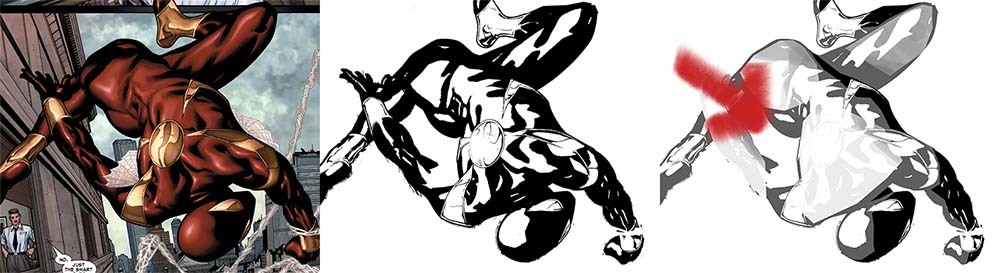
Okay, one last note: I wasn't going to make any fuss over the anatomy here but LOOK AT THOSE PERFECT HEMISPHERES ON HER CHEST. The colorist has shaded around them like there's a right angle between her boob-flesh and her chest. Sir. Please sir. I beg you. Take advice from a homosexuelle and look at some breasts. There are lots of pictures of them on the internet. I swear you'll enjoy it. Look at an actual tit just one time because I swear to dyke god they do not look the way you seem to think they look.
This time, featuring a particular splash page:

I'm going to go hard on this page because it exemplifies a giant problem I see with a lot of superhero comics. The text is telling the audience one thing, and the art is haring off in its own direction, doing another. For effective visual storytelling, you have to be conscious of what information is being conveyed by the drawing, and make sure that's the same stuff you mean to say. The above example is not managing that.
The text gives us these key takeaways:
- It's 2 in the morning
- She's late, she's broke, and she's had a bad week
- And she just got an exciting last-minute gig
- But it's eerie that the streets are empty
- SEXY LADY
- SEXY
- SEXXXXY LADY
- LADY SEXY DON'T YOU WANNA FUCK HER
Let's go through point by point and see how well the illustration is doing at conveying this information.
- It's 2 in the morning: Well, the sky is colored the pink/purple of dusk, and there aren't any visible streetlights but the trees are still casting sharp shadows, and the buildings in the distance are reflecting a blue sky instead of lit from within, so if I had to guess from just looking at the picture I would assume it was closer to dusk. The real kicker, though, is that somewhere there's an incredibly bright light source making sure to outline her thighs and boobs with shiny. It doesn't jive with the story, but boy are those spheriboobs picked out in incredible contrast.
- She's late, she's broke, and she's had a bad week: I will forgive you if you missed that Dazzler is rollerskating. If I was rollerskating with my legs like that, I would be 3 seconds from eating pavement. I love the character note that her solution to being late is to get out her skates to go fast! I do not love that the artist has chosen a bizarre floating pose that would only make sense if she could fly. This is particularly egregious because these are comic books; it is not outside the realm of possibility that I would be introduced to a flying character. But the pose is sexy, so that's been prioritized over making sure the audience doesn't mistakenly conclude things about the character. As far as being tired and beat up by the past week of X-men shenanigans and broke -- she looks perfectly put together. I'm not saying that a person who's had a bad week can't cover it up and look fab, but this is a story: for the love of god, man, give us some visual cues! Of course, broke and tired is not sexy.
- She's just got an exciting last-minute gig: I am down with her being already in her performing outfit; that's a good decision because it means there'll be continuity in what she's wearing from scene to scene. The crazy outfit is great as a stage costume. But you could show she's late and harried and going to a job by giving her a bag that's larger than a postage stamp! But, say it with me again: duffel bags full of performing equipment are not sexy. Having your makeup only half-on and planning to do the rest of it on the subway is not sexy. Storytelling is secondary to sexy.
- It's eerie that the streets are empty: This one is, I think, more subtle but extremely telling. The background does, indeed, show an empty street. But this picture doesn't convey eerie. The city around her looks like the swanky Upper East Side, with nice landscaping and clean windows: no broken pavement, no garbage out on the curb. (ETA: even the richest parts of NYC have shitty sidewalks, construction, and garbage. it's new york! so it's even failing to convey the most basic parts of the setting. and it's the 80s! nyc was notoriously not the nicest town back in the day. I also can't believe that someone broke would live within a few minutes walk from an area that looks so blandly affluent.) So that's working against the story the text is telling straight away. But the real kicker is that absolutely no woman would go out at night, alone, in a strange place, wearing a skin-tight jumpsuit cut down to the navel, and -- just -- that's not -- c'mon, man!!! C'MON! The fact that she's dressed up very sexy and doesn't have a coat or jacket to cover up conveys to me, a woman reading this, that she feels safe. And the story is saying with its words that she definitely isn't safe -- on the next page she gets grabbed by some robot-dudes. But the art -- you get it by now. Sexy.
For each of the four key takeaways, the art is sacrificing a way it could be helping the story in favor of being sexy. In some cases, it's actively working against the text. This is bad storytelling! It's squandering the medium! It's infuriating! I'm not saying that I don't like sexy lady pictures. I am a huge lesbian. Women are great! The skin-tight outfit and plunge neckline are sexy and make sense for the story at the same time. Great! Boobies! Love 'em. But sexy lady is not the most important idea going on here! If I wanted that, I'd look through my tumblr likes. I want to read a good story about superheroes and their emotions! Comics are awesome. They have all these cool tools to make narrative, which is why it's so disappointing when they ditch half of them and use them to draw tits.
Okay, one last note: I wasn't going to make any fuss over the anatomy here but LOOK AT THOSE PERFECT HEMISPHERES ON HER CHEST. The colorist has shaded around them like there's a right angle between her boob-flesh and her chest. Sir. Please sir. I beg you. Take advice from a homosexuelle and look at some breasts. There are lots of pictures of them on the internet. I swear you'll enjoy it. Look at an actual tit just one time because I swear to dyke god they do not look the way you seem to think they look.